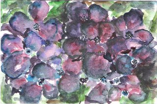
These are supposed to be hydrangeas....I started on the right side of the postcard and by the time I got to the left side I was getting the hang of it...The right side had almost zero white space which gives sparkle to the watercolors I think so I nicked out some with the point of a utility cutter which really improved it I think...wish I had scanned it before so you could see the differences...oh well...next time right??!
2 comments:
COOL hydrangeas!!!
Yes, and it's all about us learning. I like it, and you're right that the left side with white space it better...but you have tested, and now all of us understand better. Good job, Margaret.
Post a Comment