Showing posts with label Still life. Show all posts

Tuesday, October 21, 2014

Day 107 - Charles Reid Class #2


Dad's American Journey Paint
The two tubes of paint are old Cheap Joes American Journey paints that I inherited from my dad.  He was never much of  a watercolor painter so these tubes were about 25 years old and still worked great! With that in mind I did buy another ultramarine blue. One more session of Charles Reid style painting will finish this one off!!  The brush is one I bought for the last Charles Reid class I took back in March.
Dad's going to be tickled that I painted his paint when he sees it this weekend. 

Our group got THE TOUGHEST flowers in the room to paint...even Charles Reid said they were. However I am pleased with the way they turned out. A little nontransparent BUT on the whole I like it.  They were tough because they were a rusty red with the backs of the petals yellow...HUH??!

You would not believe the colors I tried in an effort to paint these. I tried  vermilion, quinacridone red, burnt sienna, aurelin, yellow ochre, ultramarine blue AND a very dark purple..ALOT of negative painting too...mostly with combos of vermilion and rust with purple and ultramarine blue added to it.


This is the setup minus my paintbrush and two tubes of paint.  I scrunched the objects together because I thought they were too strung out yesterday. We didn't have a focal light source on the flowers which was a little bit of a problem.  


This was one I played with trying to get the colors to mingle more on the paper.  I actually like it better though its not finished by a long shot.  I think I painted this in about 20 minutes at the end of class and I actually like where it was going better than the first one. Practice practice practice!


Charles finished his morning demo a few minutes early today so we were lucky enough to get to tour the Cheap Joe's facilities.  Joe himself led our tour.  He's just a sweet lovely man.  There's a gallery of his wonderful watercolors as well as other teachers and some of the employees.  We got to see his man cave office, the order center, the employee lunchroom complete with a monthly birthday cake celebration AND a scale!  Nice big windows with views.  Then it was off to tour the warehouse.  To say it was huge well is an understatement.  At least as big as two football fields.  Joe said he could teach us to fill an order in under three minutes no problem.  We also got to meet his top employee Robert who packs the thank you gift you get with every Cheap Joes order.

To say that the staff and owner of Cheap Joes bent over backwards to make our week PeRfEcT would be an understatement.

If we thought we wanted something from the store not a problem...we run a ticket.  If it was only in the warehouse it magically appeared in no time flat!!

The only way he could improve our experience is if he added a dorm and a dining hall!! :)


Our morning demo.  Watching Charles Reid paint is like watching a magician wave his brush and create magic.  A daub of paint here a daub there and magically the flowers appear.  Just totally enthralling to watch him paint, and Cheap Joes makes sure we can see every stroke in a large flat screen tv set up so everyone can see the teacher working. I painted that same wine bottle yesterday.  WHY doesn't it look like his??!


Charles Reid's set up!


Charles Reid paints!


The wonderful Judy Reid, Charles' wife, retired Kindergarten teacher, aka the Boss, loves to tell stories and make jokes.


After class a classmate, Diana and I went on an adventure looking for old barns and beautiful mountains to photograph.  This is a charming church we found about ten miles out of town down a winding mountain road...on HWY 140 I think!  A beautiful drive that Joe sent Diana and I on in search of gorgeous views.


A view round every bend in Hwy 140...lots of great barns!!

Thanks for looking!!

Monday, October 20, 2014

Day 106- Day 1 with Charles Reid!!


I am at Cheap Joes taking a class from the awesome Charles Reid...the author of 12 books with North Light and many dvds on how to paint like Charles Reid.
Even Joe himself of Cheap Joes is taking the class!! Two days of flower painting and hmm two more days of value studies.  

Cant say enough about how great everyone at Cheap Joes is.  The classroom is just terrific.  We can see every stroke on the HUGE flat screen tv in front of the room.  We each have our own work table, lots of great light, terrific catered lunch, AND last but not least there were guys to help us schlep our stuff from our cars to our tables!! Going to have to take another class at Cheap Joes!!


This is what I painted today.  I am oh so more pleased with it than any flowers I painted in his class last spring.  I actually got the idea of negative painting. I didnt destroy my whites and lights like the daisies...last time I made a hash out of them.    My only critism of this painting is that the wine bottle and pumpkin look lost over on the left by themselves and the vase is DEAD center...never a good look. 


So I cropped it...think this one looks ever so much better than the whole picture.  The bottle and the pumpkins look good but ..hmm that can be a whole other painting right?!

Which one do you like better??


This is the master Charles Reids painting from today. Is it not AWESOME!! I love everything about it.  Notice his wine bottle touches the flowers UNLIKE mine.  

Enough for now. I could do another whole post on the great fun Mike and her husband Allan and I had going to Mast General after class taking pictures of great barns and pumpkins in the valley there BUT I am tired and taking a shower!! 

More tomorrow!!

Thanks for looking!!


Friday, September 19, 2014

Day 74 - Flowers


The set up

I am taking a class with Charles Reid in about a month and I decided I needed to practice painting flowers/still lives.  I think flowers are SO hard to paint...I don't know why. I would rather paint just about anything than flowers!

I have alot of fiestaware for my everyday dishes so I decided to use them in the piece.  It's painted on Kilimanjaro Cold Press and is a half sheet in size 15x20".
I like Kilimanjaro because its tough. You can lift color off if you don't like it.  I have even washed a whole sheet of it under the faucet. ReALLy!! I have scrubbed it with a scrubby and sanded it with sand paper. TOUGH paper!!


The Start

B pencil on Kilimanjaro


A start

So far so good!!
I started painting at the top of the flowers and began working my way down.


Thought you might like to see where I paint...here it is as a WIP on the easel.


I liked everything about it at this point BUT the flowers. I DONT know why but they just drive me C R A Z Y!!!

I changed the colors of the striped fabric because I didn't think it went with my color scheme.


I decided to darken the background because the flowers were just getting lost in the cerulean and yellow ochre background...wonder if it was because the yellow ochre was really close in value to the yellow of the daisies??

I also added more pink to alot of the flowers...quinacridone magenta and I thinked that helped too.


These are the parts I really like...I LOVE the way the teapot turned out!


I also really like the apple and lime! And the two fiestaware plates. 

Tuesday, July 29, 2014

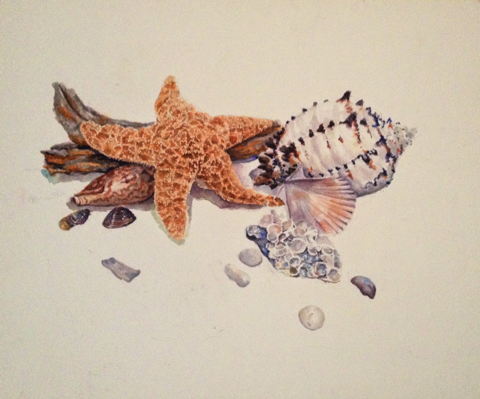
Day TwEnTyThReE- Seashells Nearly Done!!

I am hoping to make it to thirty consecutive posts...only 6 more I think!! Daily posting gets to be like ALOT of work.  I need a nap but NO time!!! 

Now it's a challenge to see it thru  a month of posting...hopefully I will keep posting a few times a week after that!!


The Seashells NOW

I really love the way the seashells are coming along.  I still have to add the sand and do a little more to the drift wood but I am QUITE happy with it at this point!! 

The thing I like about painting seashells is that no one knows that my starfish, my lettered olive or my scallop shell is not exactly like the original because there are no two identical seashells...as long as you are in the ballpark...no one will know the difference...what I don't like is all the 100 finicky layers of sheer color BUT I DO love the result...the glow you get from it!!

Thinking about putting it over my bed unless YOU want to buy it!! It's approximately 15x20".


The seashells last time you saw them...just for comparison...it's been getting tweaked in between all the working in my moleskine watercolor sketching/journaling.

TIP : Got the rust colored stain off above the drift would with a Mr. Clean eraser. If you look its no longer in the almost done pic...the first pic in this post.They are GREAT for removing stray watercolor blobs!! I cut them up into small pieces and wet them ...wipe away gently at the offending watercolor and it disappears without messing the paper up...well as long as its good watercolor paper. LOVE that Mr. CLeaN!!